Global Biosphere
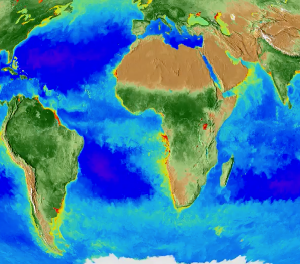
This data visualization shows the Earth’s biosphere from September 1997 through September 2017. Credit: Alex Kekesi. Download this movie.
Source: NASA/GSFC
[14-Nov-2017] This data visualization shows the Earth's biosphere from September 1997 through September 2017. It represents twenty years of data taken primarily by SeaStar/SeaWiFS, Aqua/MODIS, and Suomi NPP/VIIRS satellite sensors, and shows the abundance of life both on land and in the sea.The colors in the visualization represent chlorophyll concentration. In the ocean, this primarily reflects phytoplankton concentration. The dark blue to violet areas of the ocean represent regions where there is little phytoplankton growth due to lack of nutrients. This is contrasted by the nutrient-rich areas in greens and reds where phytoplankton are blooming. Many of these nutrient-rich areas are in coastal regions where cold water rises from the seafloor bringing nutrients along with it and areas at the mouths of rivers where nutrients from the land flow into the ocean. On land, green represents areas of abundant plant life, such as forests and grasslands; tan represents areas where plant life is sparse or non-existent, such as the deserts in Africa and the Middle East; and white represents snow and ice at the poles that expands and contracts with the seasons.
This data visualization shows the Earth’s biosphere from September 1997 through September 2017. Credit: Alex Kekesi. Download this movie.


